Proposed Design
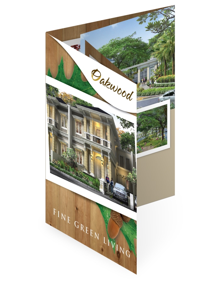
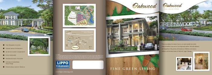
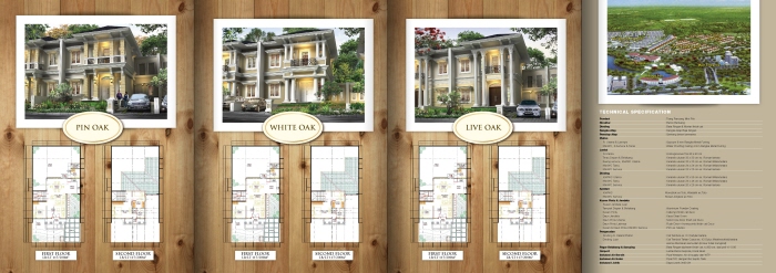
Client: Lippo Cikarang
Agency: Arte Studio

Idea Builder, Branding Strategist, Graphic Designer, Illustrator
Proposed Design
Client: Lippo Cikarang
Agency: Arte Studio

MIKTI (Indonesia Digital Creative Industry Community) is a nonprofit organization functioned as a gathering place for all people who pay attention to the development of Digital Creative Industries in Indonesia. MIKTI was established on December 16, 2008. MIKTI activities are focused on efforts to build the sustainable and competitive ecosystem for the growth of Digital Creative Industries in Indonesia.
Digital Creative Industries including:
• Game Industry
• Education Software Industry
• Digital Music Industry
• Animation Industry
• Software & Application Industry
The concept of this logo is represent the industry itself. It’s all about the Ideas, Technology, Communication and Human. This logo represent the brightest ideas of everyone in this industries (technology & communication) and share it to the community for the better community and future.
 Client: Kementrian Komunikasi dan Informatika
Agency: Megindo Communications

Natural Ingredients are the main concept of Ekasari. Leaves and branches as main parts of flora and represent nature are taken and form as Ekasari identity.
Client
Beverly International
Agency
Invent Design
Role
Designer
Imperium is Training Boutique that provide human resources training with worldwide training licensed such as Zig Ziglar, outbound and coaching program. For Imperium Identity, we build something bold and strong with silhouette of Lion, to represent the place for the best training to become great leader. Blue as royal and professional are used to make the brand itself strong and representatives. Client: Imperium
Agency: Megindo Communications
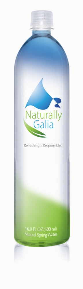
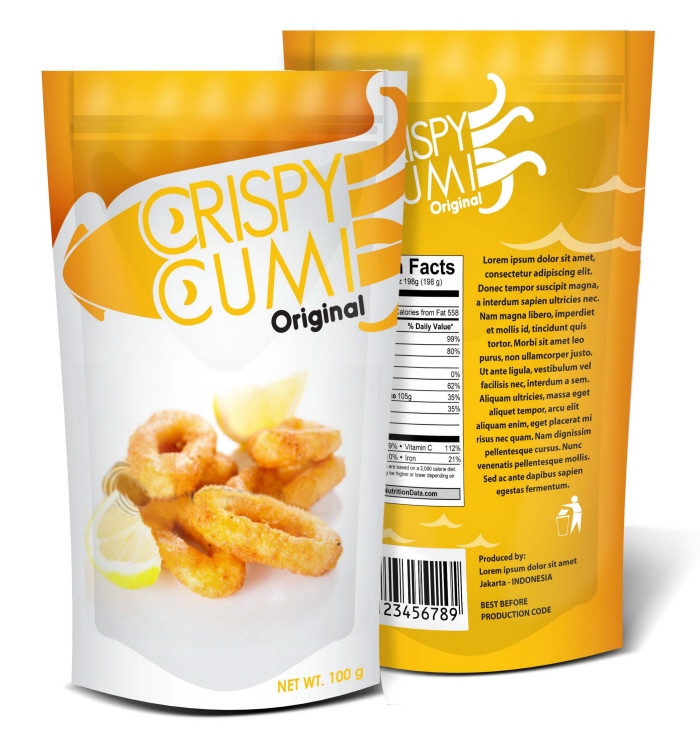
Branding & Packaging Project Contest
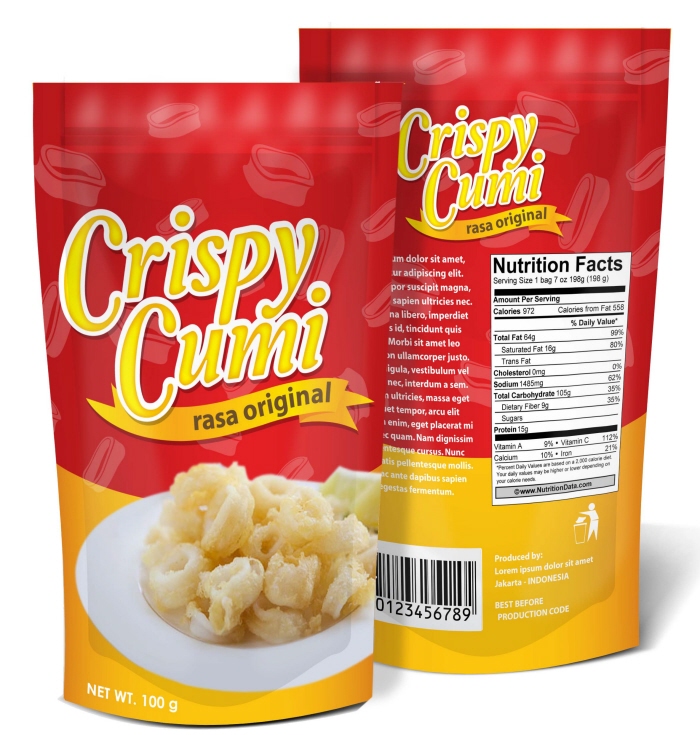 Proposed Design
Agency: Arte Studio
Ilustration: Victoria
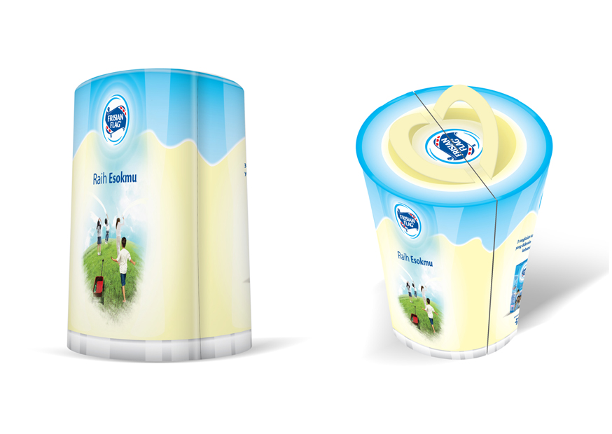
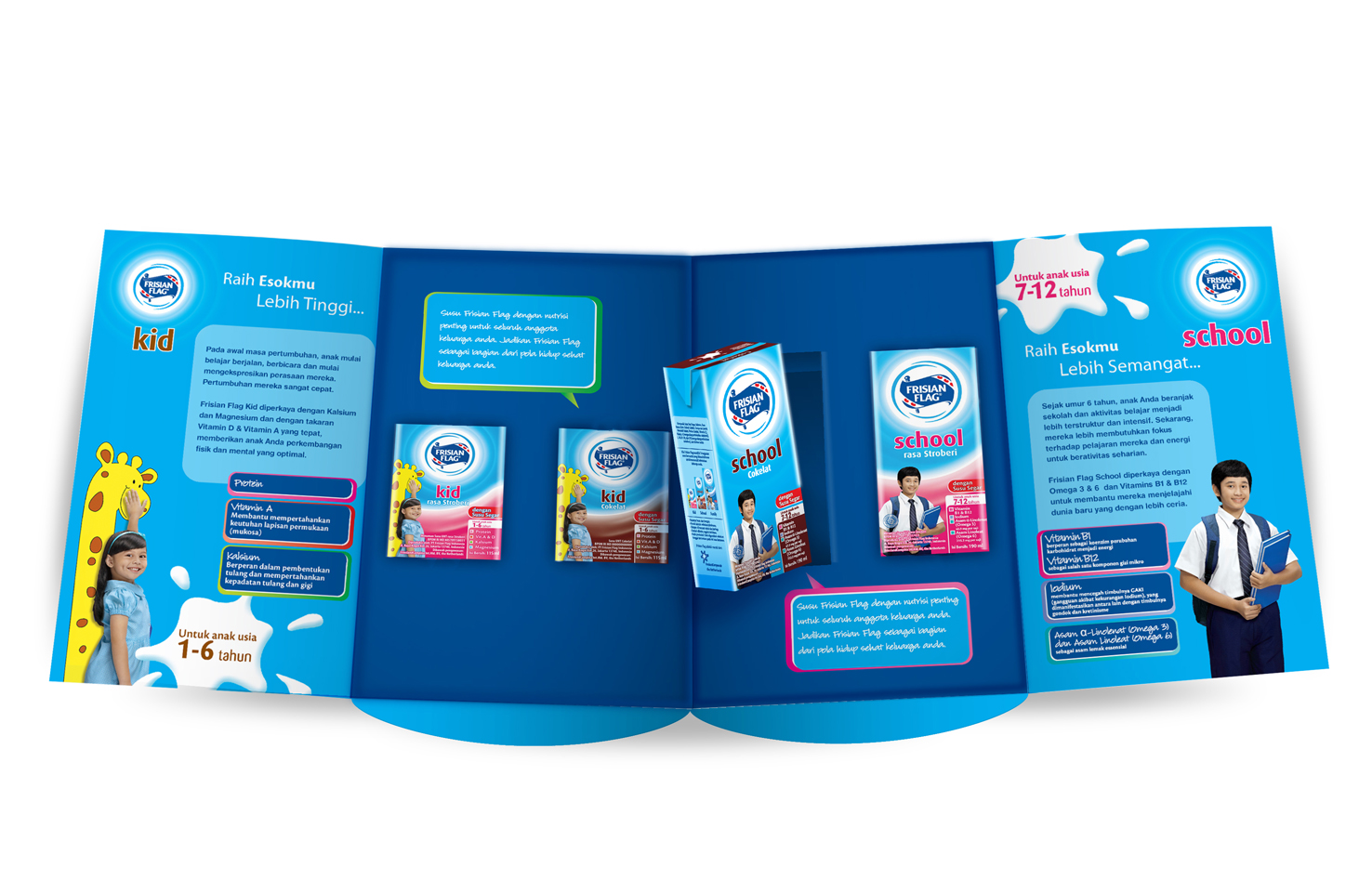
Supporting the new branding and new marketing campaign of Frisian Flag, The sales department distribute the retail sample pack for the retail business like Carrefour, Giant, Hero, etc. The Sample Pack is design in unique pack and have function and information.
Here, we create the giant glass of milk, that can be carried and packed neatly and easy to stack. Inside the pack there is 2 size of Frisian Flag milk in 2 flavors. There are some informations in every wings. And after that, it can be used for carry lunch/ used as saving bank.
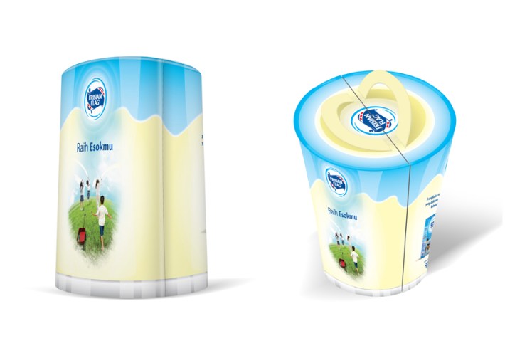
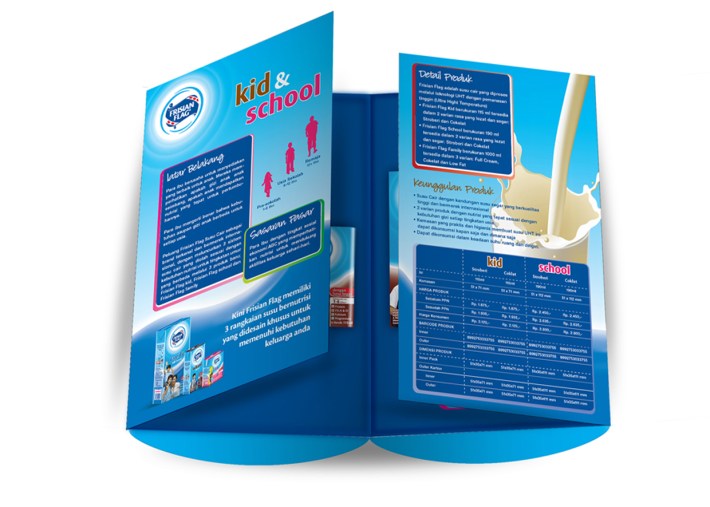
Proposed Design
Client: Frisian Flag
Agency: Arte Studio




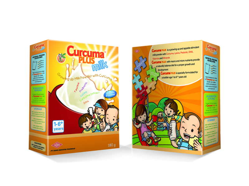
 Client: Soho
Agency: Invent Design & Co
Illustratior: Yoris Handoko
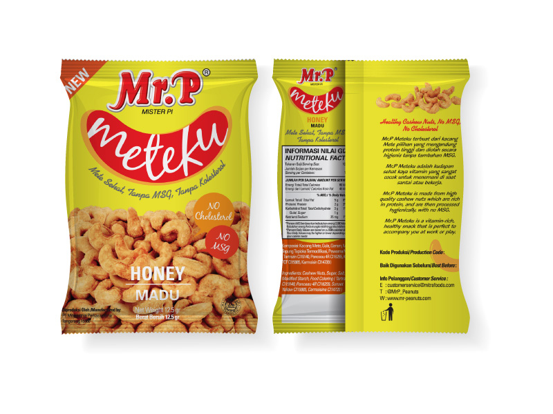 Client: Mitrafoods
Account: Clara Emilia
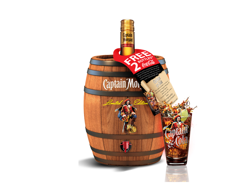
Captain Morgan always drink together with his crew. Singing, dancing and drinking rum celebrating their adventure. They share rum, gold and enjoying life together. This concept is brought into the limited edition pack of Captain Morgan ® Original Spiced.
Celebrating The Togetherness.
Captain Morgan ® Original Spiced is the best companion wherever you and your friends hang out and having parties. It’s like Captain Morgan and the crew celebrating. So the idea is, A cocktail Barrel for party. A jug with tap where you could place your favorite cocktail and serve it.
The Captain Morgan Cocktail Barrel
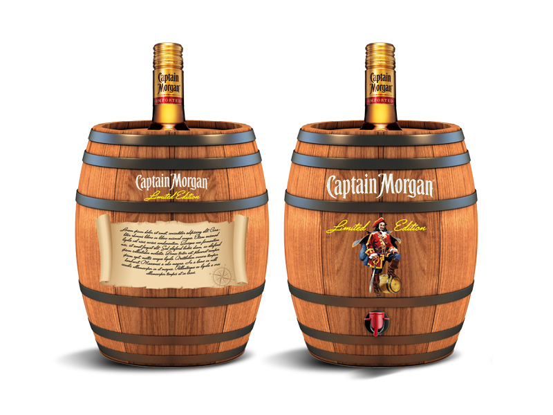

 The Captain Morgan Cocktail Barrel is a package of limited edition of Captain Morgan ® Original Spiced. The Captain Morgan Cocktail Barrel could be used for parties, so people could make their favorite cocktail (Captain & Cola) in the barrel and the guest can easily refill their glass.
The Captain Morgan Cocktail Barrel not only collectible but also can used after, so the brand is stronger wherever you had home parties.
Specification:
Size of the barrel:
diameter: 19 cm
Height: 23 cm
Material: Plastic molded with shape of barrel.
Painted in outside, with lid in upside with hole in the center.
Finishing: logo & character Captain Morgan and Tap
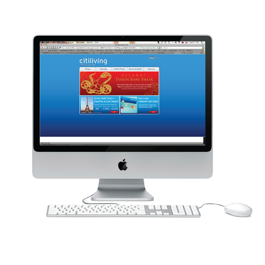
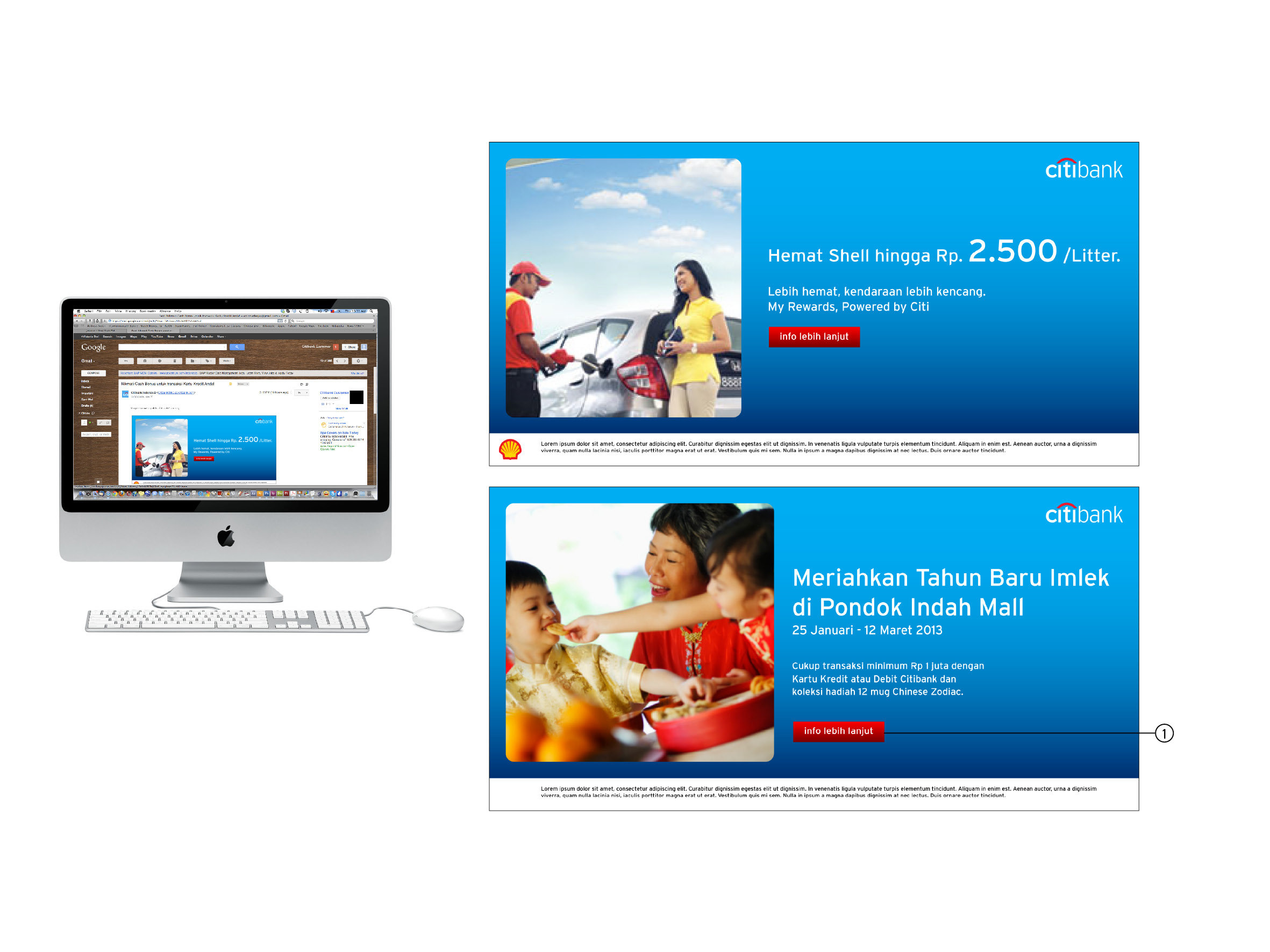
 Proposed Design
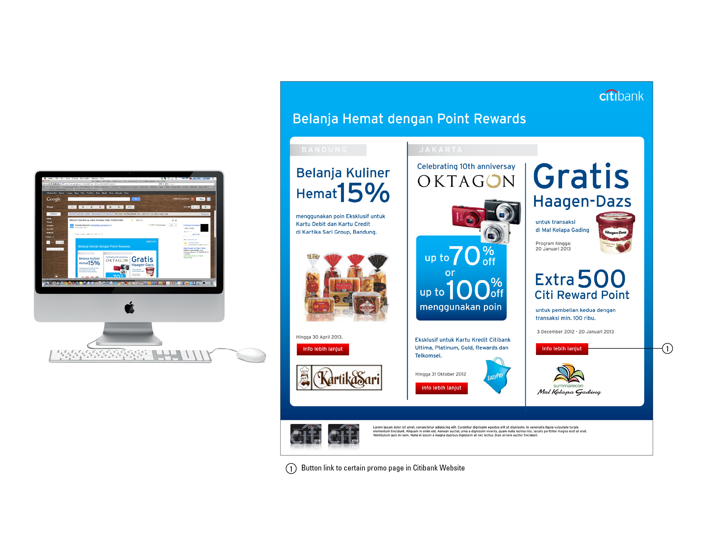
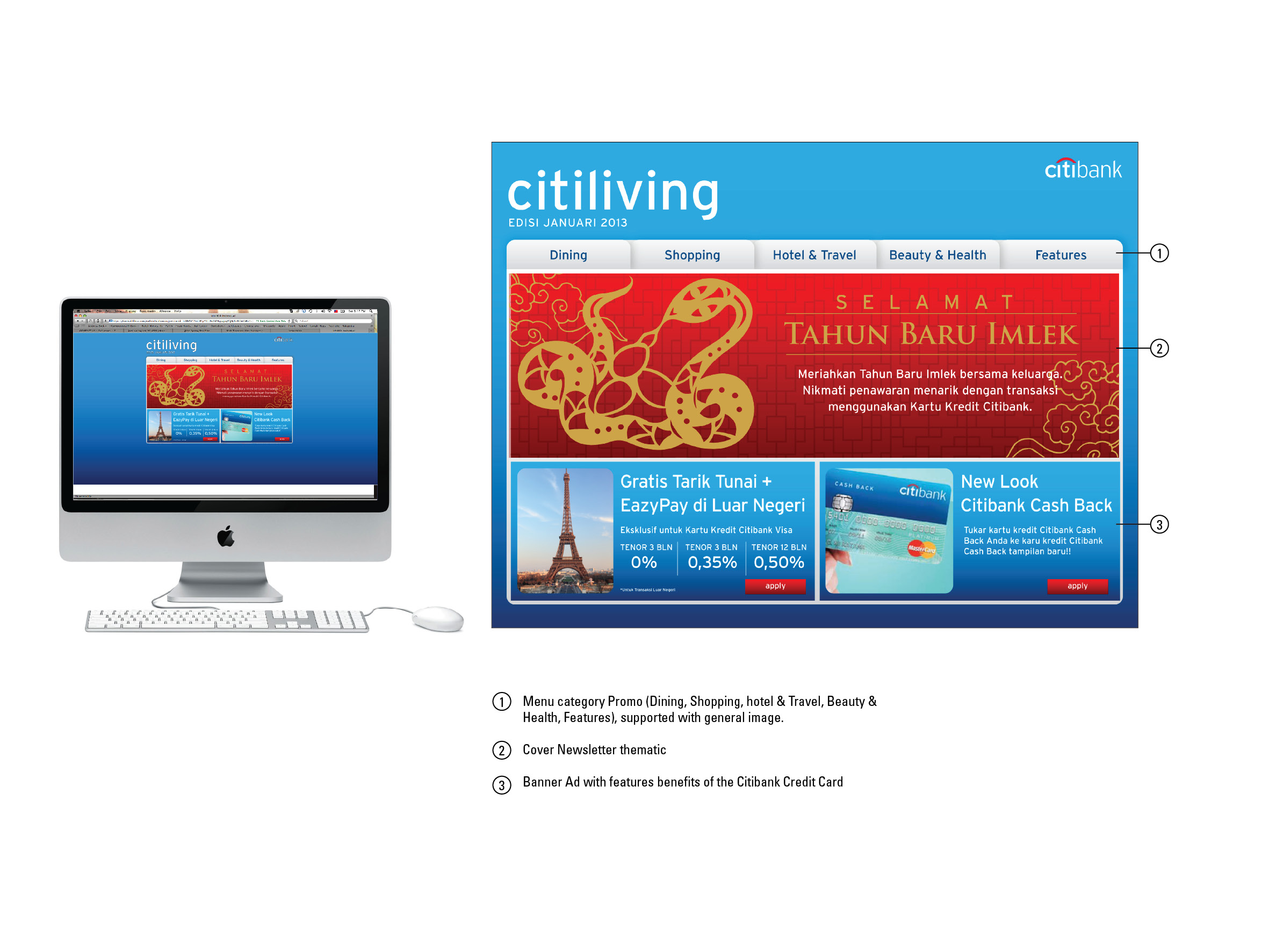
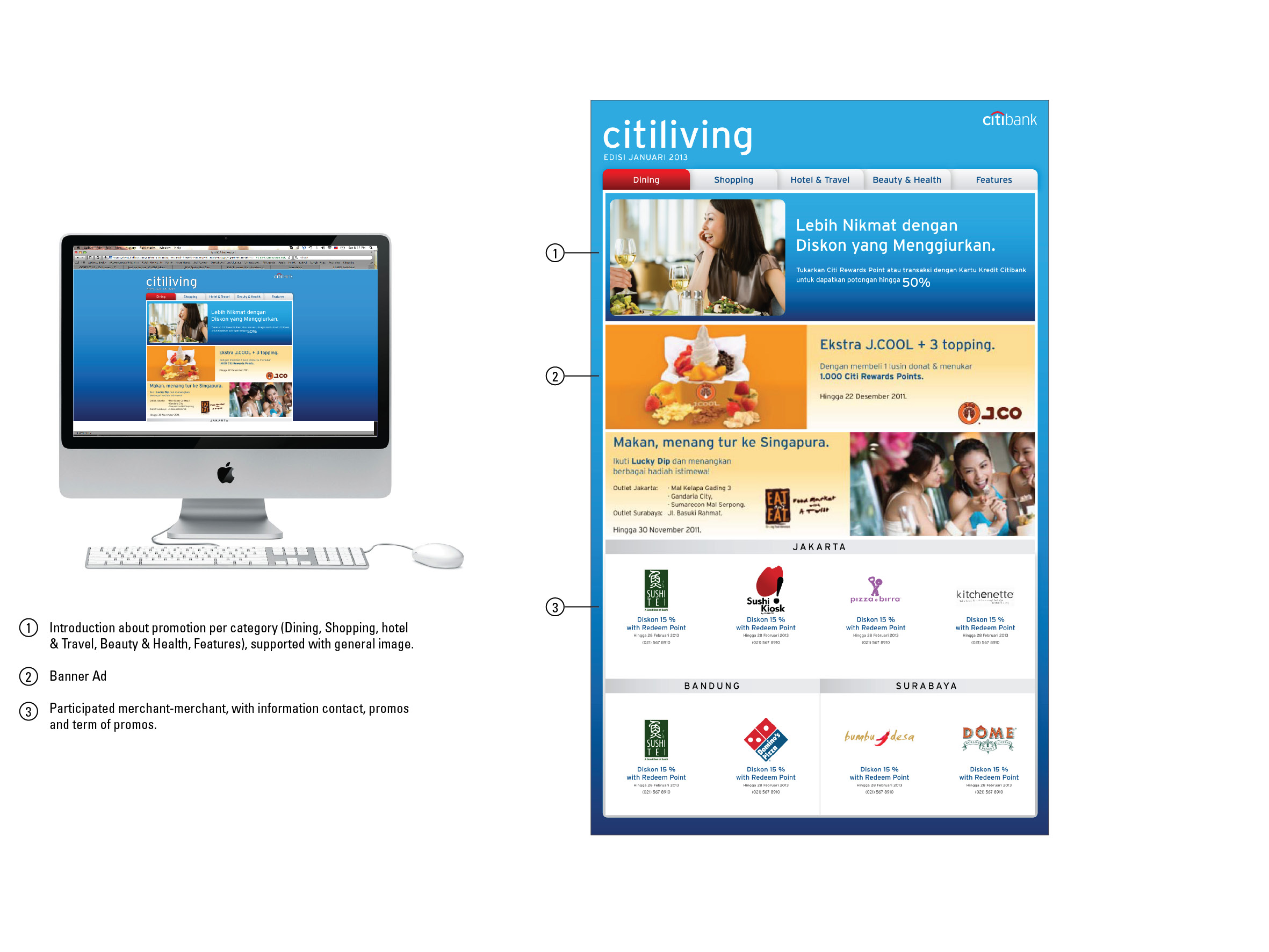
Client: Citibank
Agency: Arte Studio
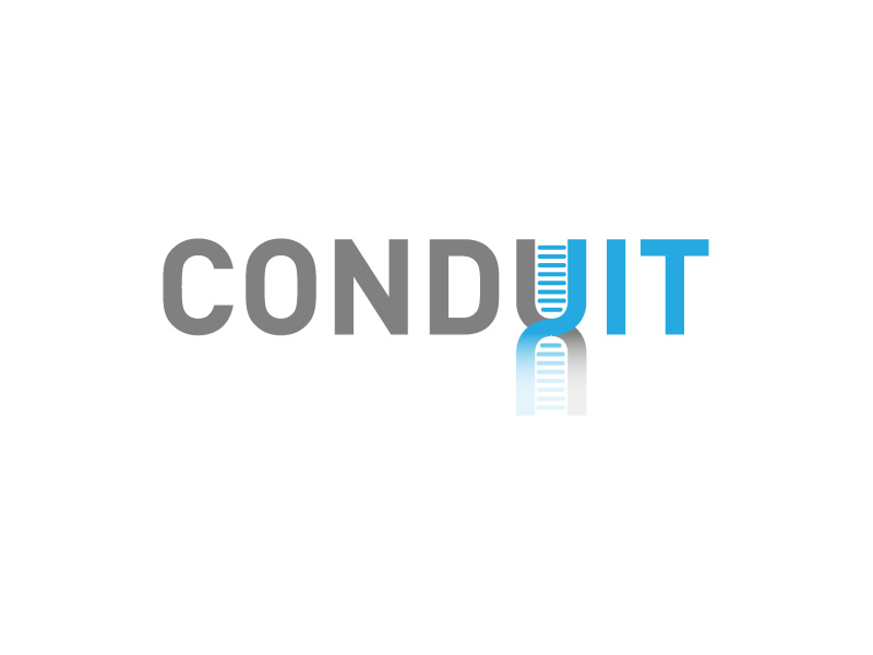
Based on the brief that wanted a logo for a project that aim to combine patient medical data with genetic information and real-time vital signs monitoring. The logo represent the look of “IT” and incorporated with medical them like DNA . To look professional and fairly modern, I put the color of grey and light blue to give the image of technology, innovation and modern. In alphabet “U”, I modified the look into the DNA chain that form modernly on shadow.
Logo Design Project
on Designcrowd.com
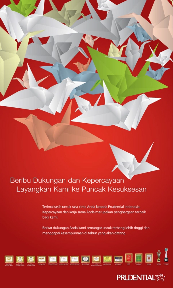
People said making lot paper cranes is a way of wishing something goods. So from that concept we apply that to Prudential Thank You Ad. We want to show that with lot of support and great cooperations from employees, partners and customers, Prudential have certain achievements as the best in the eyes of public.
Client
Prudential
Agency
Arte Studio
Role
Copywriter & Ilustrator
other alternative (unchoosen design)
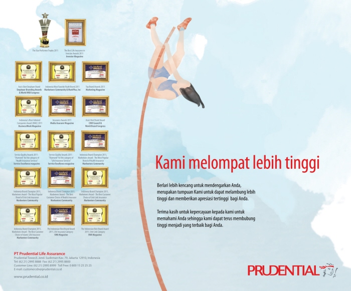
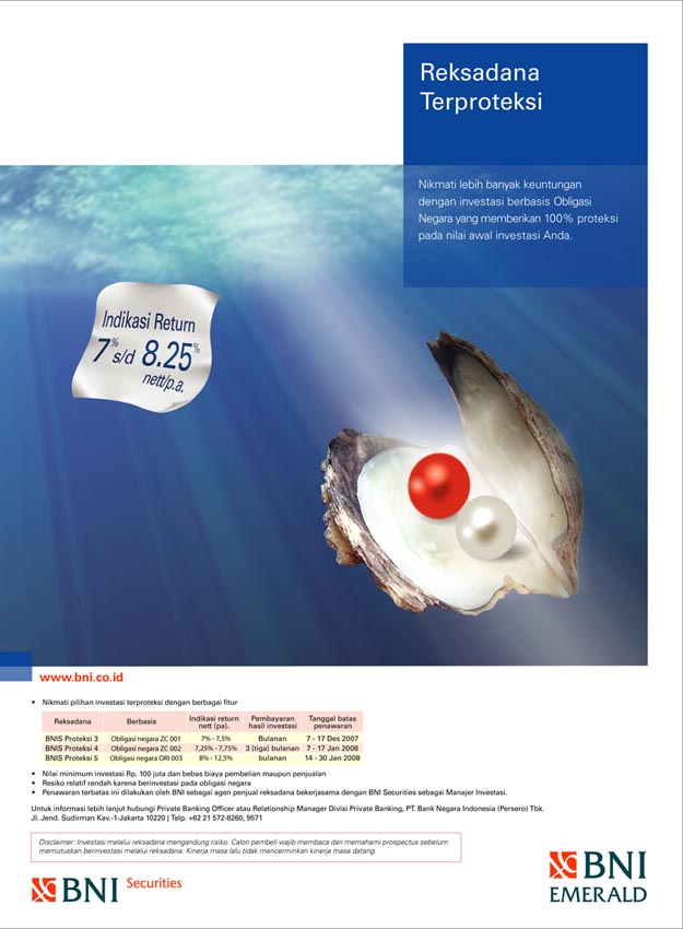
Client
BNI Emerald
Agency
Komunikasia
Digital Imaging
Sandy
Role
Designer
Have a WordPress.com account? Log in now.

