Prudential Calender – We Believe in Listening

Prudential, Always Listening, Always Understanding

We Believe in Listening

With communication campaign of Prudential, “We Believe in Listening”, we try to apply that campaign into calendar that also could help to boost and widen the campaign.

In this calender we try to explore how that word of “listening” is very strong and become the base of service from Prudential. By listening, Prudential could understand and give solution to the customers.

OLYMPUS DIGITAL CAMERAOLYMPUS DIGITAL CAMERAOLYMPUS DIGITAL CAMERA OLYMPUS DIGITAL CAMERA OLYMPUS DIGITAL CAMERA

OLYMPUS DIGITAL CAMERA

OLYMPUS DIGITAL CAMERA OLYMPUS DIGITAL CAMERA OLYMPUS DIGITAL CAMERA OLYMPUS DIGITAL CAMERA OLYMPUS DIGITAL CAMERA OLYMPUS DIGITAL CAMERA

Client: Prudential
Agency: Arte Studio
Copywriting: Hermanto Lim

Indofood Calendar

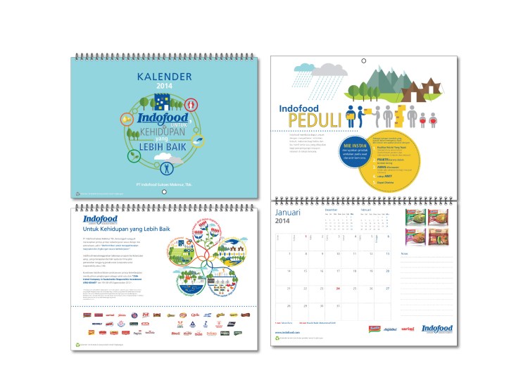
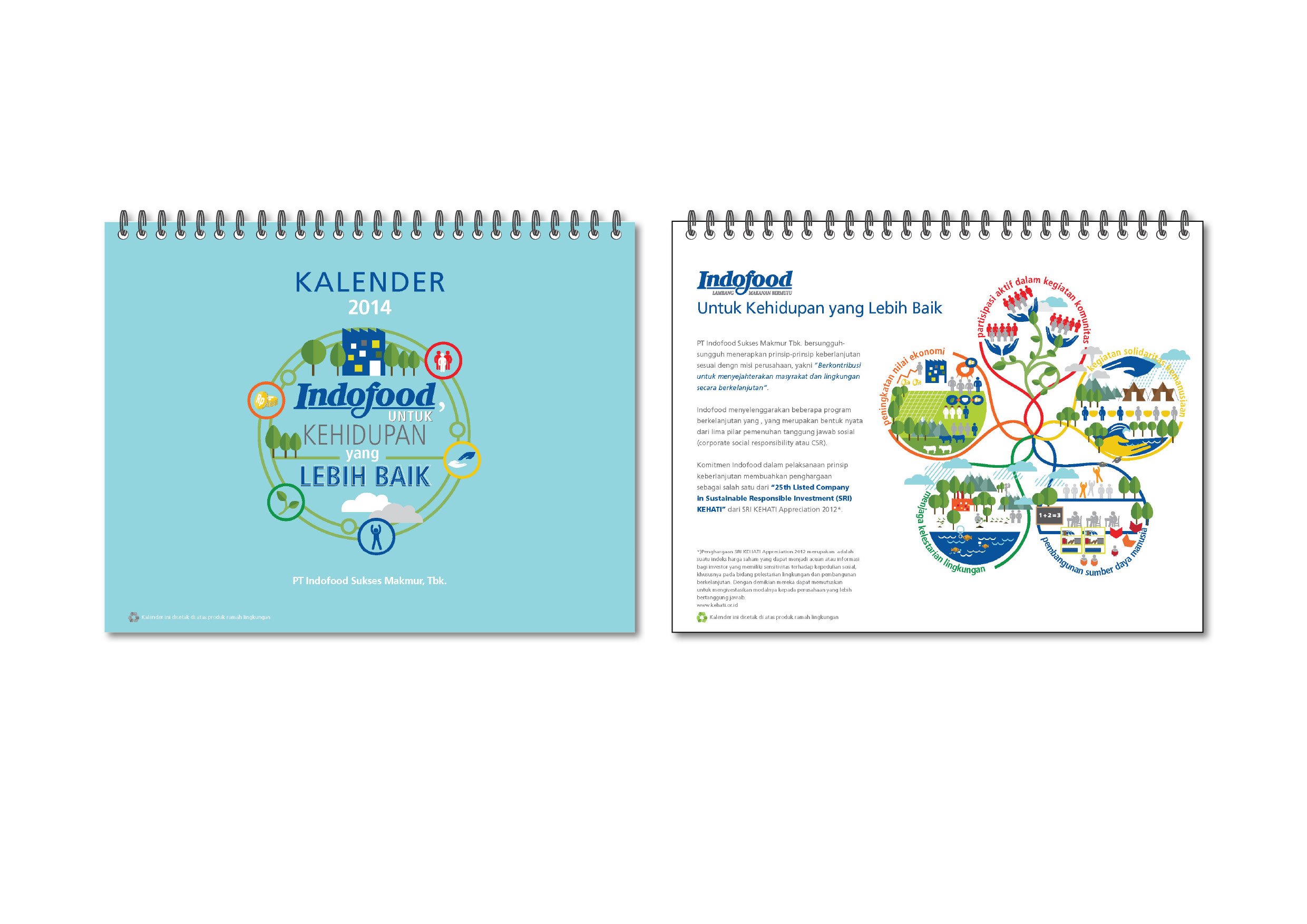
INDOFOOD, untuk Kehidupan yang Lebih Baik
(Indofood, For A Better Living)

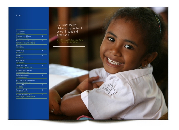
In this concept, we want to explore about corporate social responsibility that have been done by the company. This programs are sustainably done in order to fulfill the company mission, which is community welfare and environment continously.

There are 5 programs that will be execute through illustration.
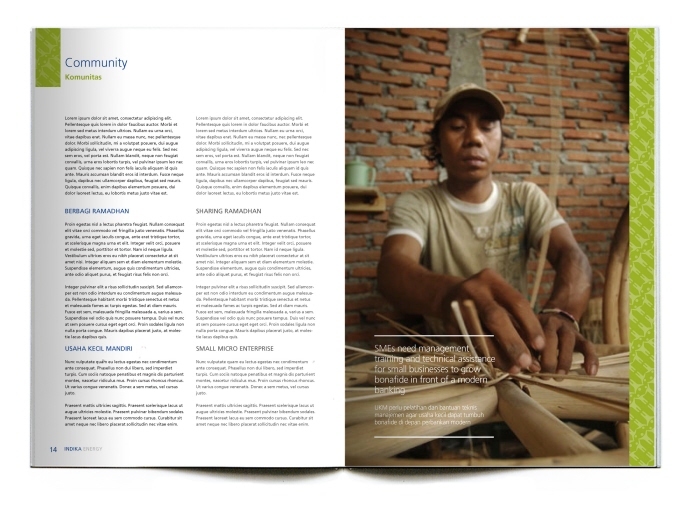
1. Participation in Community
2. Human Solidarity Activity
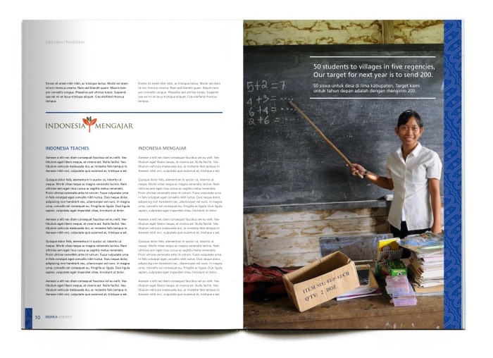
3. Human Resources Development
4. Environment Preservation
5. Economy Value Enhancement

indofood

INDOFOOD PEDULI (Indofood Care)

As the biggest instant noodle manufacturer with brands known in all Indonesia, Indofood realize that the product, Instant Noodles suitable for emergency food.

Indofood also understand that Indonesian geographical that fragile of nature disaster and could happen anytime. And as part of Indonesian, Indofood is always contribute as part of social responsible in every national disaster.
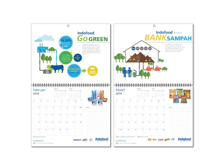
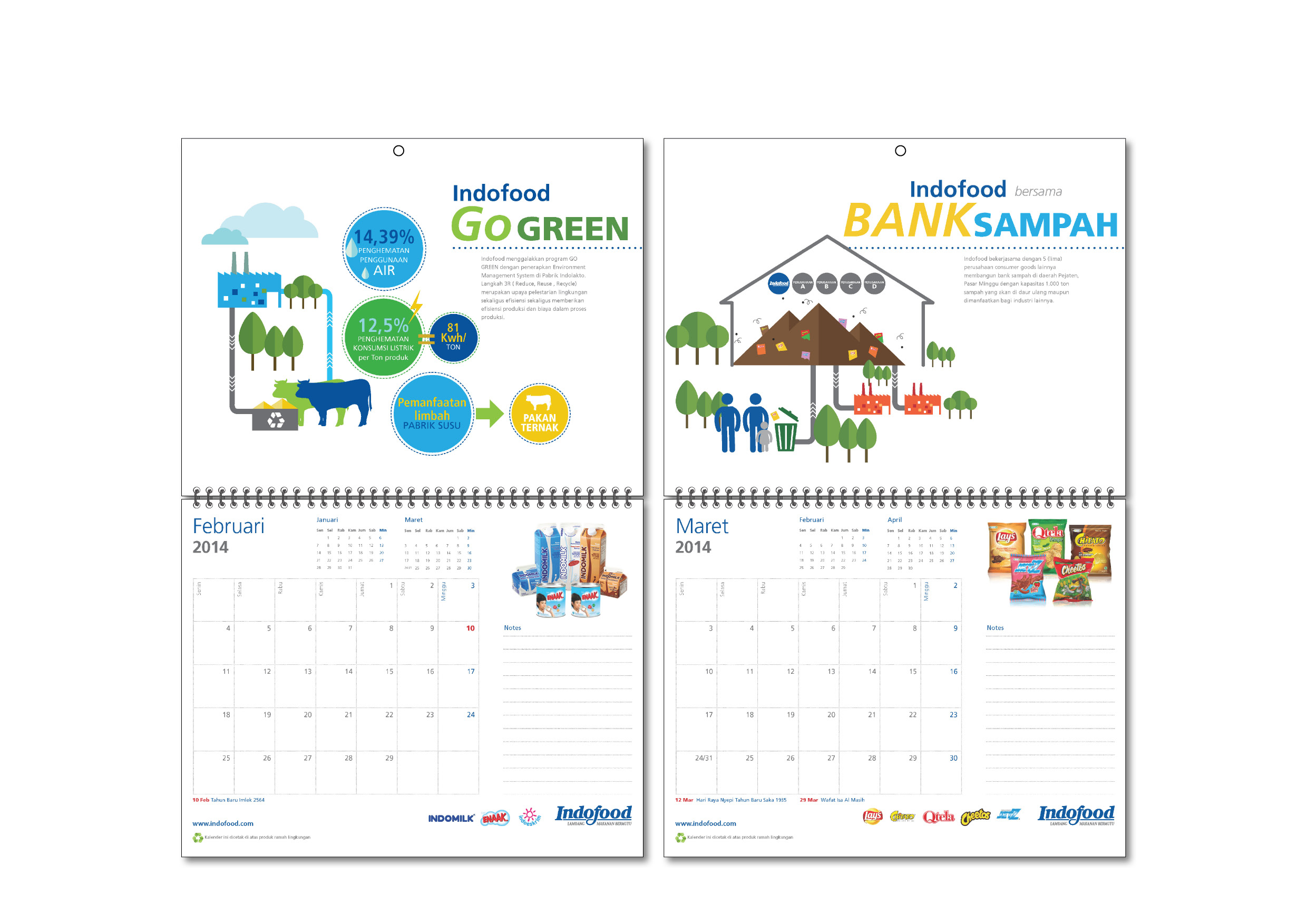
indofood2

INDOFOOD Go Green

Indofood is concern about environment. One of them is doing the integration farming in their ranch. Not only giving the efficiency and sustainability but also reduce the waste from dairy production. This is also give good effect to energy safe, water safe in Indofood maufactures.

indofood3

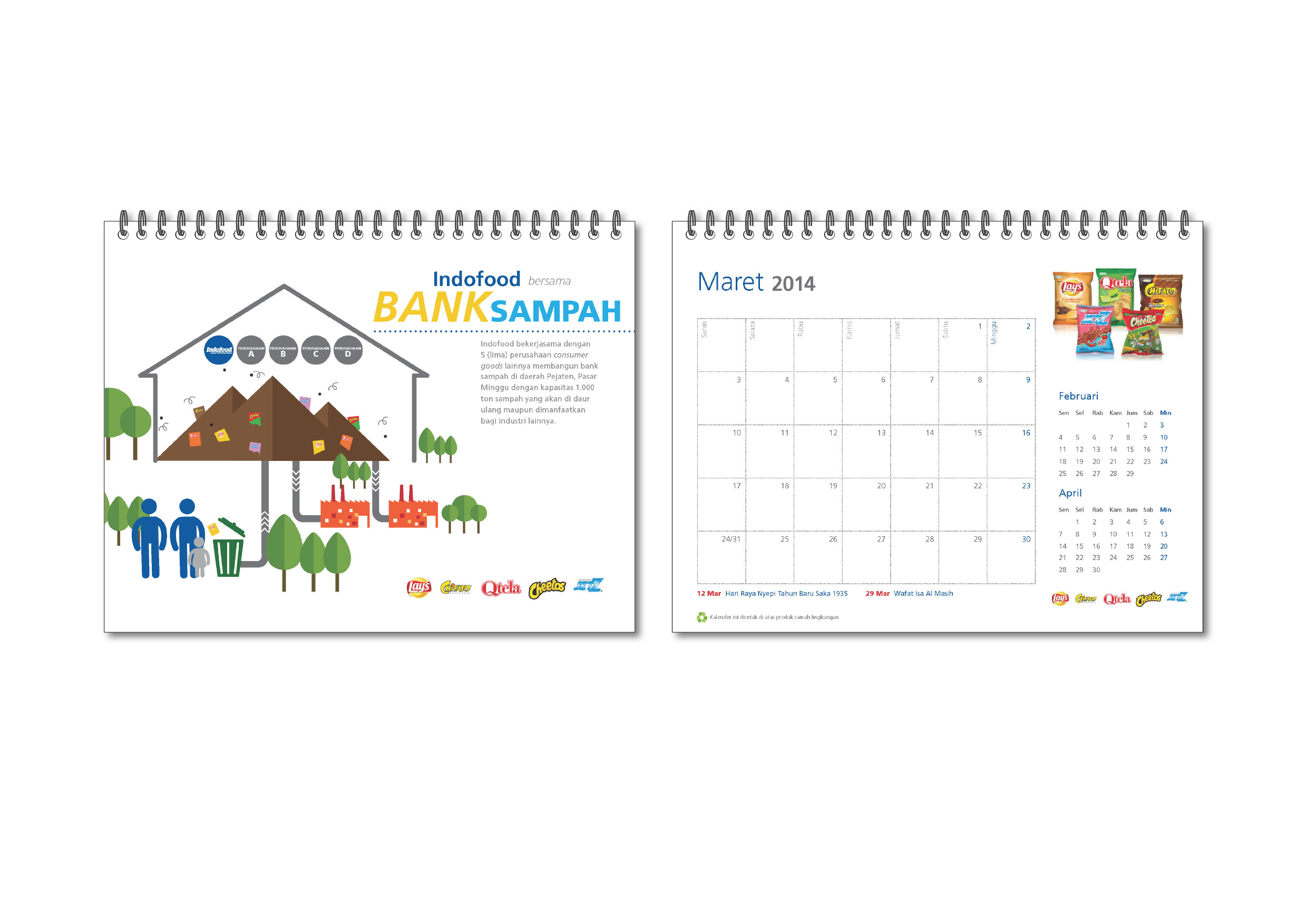
INDOFOOD Bersama Bank Sampah (Indofood with Trash Bank)

Indofood realize that their products will leaf the packaging behind. Especially the snacks products which the packaging are made of plastic and could not perished by ages. But this doesn’t make Indofood leave the responsibility to the customers. Indofood together with other company build the Trash Bank that will be collect the plastic waste and recycle them into other functional products.
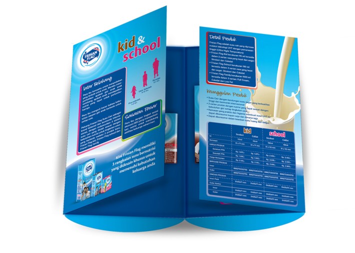
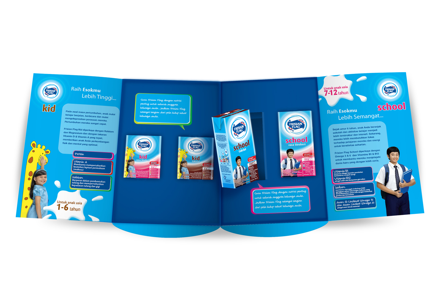
indofood4

Wall Calendar


indofood5 indofood6


CIMB Niaga New Year Kit

Membuka Akses Melalui Inovasi (Accessibility Through Innovation)

CIMB Niaga is continous development Bank that always keep up with innovation in order to maximize the local potential and wide netwoorking that CIMB have.

In this 2014 new year kit, we try to propose digital exploitation and tech innovation from CIMB Niaga. With the breakthrough product of CIMB Niaga, Rekening Ponsel, and the vision toward branchless banking, we want to give the message to public about the wide and innovative access given by CIMB Niaga.

In visual of calendar we put 7 images with double impossed of 2 images that giving the double meaning. One is technology and two is access. The image will describe the innovation products that CIMB Niaga given through device application, such as:
1. Rekening Ponsel ( Phone Account)
2. CIMB Clicks (Internet Banking)
3. Go Mobile
4. Digital Lounge
5. Phone Banking
6. ATM

and multi city in South East Asia on background as the value of wide networking that could be accessed by the customers.

KALPRES1 KALPRES2a KALPRES2 KALPRES3a KALPRES4 KALPRES3 BOARD_pres

Wall Calendar
Print

Monthly Planneragenda isi_pres3 agenda isi_pres4 agenda isi_pres1 agenda isi_pres2

Proposed Design
Client: CIMB Niaga
Agency: Arte Studio

International Financial Center Jakarta Branding

The First International Financial Center in Sudirman Road. Developed by The Best developer in Singapore, Kepple Land, IFC Jakarta Tower 2 is starting constructed. This elegant architecture with full-glassed facade inspired the shape of the identity. With the color of blue as glass house and asymmetrical shape of the facade giving the character of new landmark of commercial building in Sudirman.

Client
Kepland Investama

Agency
Arte Studio

Copywriter
Hermanto Lim

Role
Project Lead

Designer
Stephanie

Web Development
Sakti

South Pacific Viscose Calendar

Vibe To Grow

More than 30 years SPV has been the leaders of the market of Viscose Fiber in Indonesia. The presence of SPV is a vibe of textile industries in Indonesia and after the 30th years in 2013, SPV still grow bigger and bigger.

The concept of the calender is Vibe to Grow is the way SPV to communicate the existence of them in 30 years as leader in Viscose fiber in Indonesia. The concept of vibe, try to be visualized as an artful dynamic threads.

The visual represent the movement, playful, dynamic, colorful and unstoppable

KALENDER 3d_spv3_1

Every month the visualized form into thematic color, and also supported with the copy about the strength of SPV through history.

For example
“Lead the market in viscose fibers and sodium sulfate since the commercial production on 1st May 1983.”
We put some milestones of SPV through the copy

 In the second month we talk about the quality and we combine it with the highlight event in 1984 that High tenacity fiber was produced.

In the third month we talk about the volume of the capacity production combine with the year of 1986 where SPV did the first 100 MT production

Print

Proposed Design
Client: South Pacific Viscose
Agency: Arte Studio

Indika Energy Sustainability Report

Growing Together in a Smart, Healthy and Educated Community
Sustainability Report could be one of effective way in building a good public relation. Not only giving the reports of activities and contributions for helping the nation beside cultivating the country’s potential, but also could earn good aims image to public.
A good report could be a good report. Here in proposal design for Sustainability Report for Indika Energy, we try to explore the character of the nation through the element of pewayangan “Indonesian Puppet folk story”. In the cover we try to make an utopia world where people & environment are synergized. Indonesian children get the proper education, the environment are protected and nurtured, The potential of nature are managed well, etc.
With a folded cover with an artistic “gunungan”, finished by laser cutting, so reader could see through a glance of image behind.
Gunungan / “mountain in english” is a mark in puppet show, usually represent beginning or ending of scenes. In Gunungan, usually there is a tree of life, where animals are life among them.
In this report, we try to combine it with the company’s messages that Company is also a tree of life where together with community surrounding grow together and having all mutual benefits and needs.

284289_PxlYC8uO7OP9MMad1A1yODcDk284289_iXXkSQh9z6LTJPhlhjVFhSOfZ284289_LOg4vCthQhlJ5QdkyZ54NWzMa
284289_2HpQMysEPl_e2cbZLgZM4Thku-1284289_RY8X3oNwelQSPqRr6RqGIgsBg 284289_slifI8wNMfScT9rGGlFTeofnH 284289_tvdlYqQ_HZdP7AuiBAPr1ADCn284289_ahkqaCufWNiTdoW5xdtanGk5R 284289_wJ7sJDQ4XMqRhDYlb0xAqHJ95284289_87UjTqD72N0lrtzZo4Zh1s8JY-1


Proposed Design

Client: Indika Energy
Agency: Arte Studio

BII Maybank Ied Greeting Card

284289_BzhgxT8xo7nR5HaJryfyXLUnRBII Maybank Ied Greeting Card – For most moslems Id Ul-Fitr is a winning day after 30 days of fasting. And in the night of Id ul-Fitr, the sound of takbir is around the show it’s the end of Ramadhan. We try to mix up the concept of alarm of a new rise of life with drum that used to sound Takbir. We hope this card describe the wake up call into a new day.

Client: BII Maybank


MIKTI Logo

MIKTI (Indonesia Digital Creative Industry Community) is a nonprofit organization functioned as a gathering place for all people who pay attention to the development of Digital Creative Industries in Indonesia. MIKTI was established on December 16, 2008. MIKTI activities are focused on efforts to build the sustainable and competitive ecosystem for the growth of Digital Creative Industries in Indonesia.

Digital Creative Industries including:
• Game Industry
• Education Software Industry
• Digital Music Industry
• Animation Industry
• Software & Application Industry

www.mikti.org

The concept of this logo is represent the industry itself. It’s all about the Ideas, Technology, Communication and Human. This logo represent the brightest ideas of everyone in this industries (technology & communication) and share it to the community for the better community and future.

284289__mZ0AnCXTrKOOpXqE5dBZGmmtClient: Kementrian Komunikasi dan Informatika
Agency: Megindo Communications

Imperium Branding Logo

Imperium is Training Boutique that provide human resources training with worldwide training licensed such as Zig Ziglar, outbound and coaching program. For Imperium Identity, we build something bold and strong with silhouette of Lion, to represent the place for the best training to become great leader. Blue as royal and professional are used to make the brand itself strong and representatives.284289_vYej0ssqifLAisGw646a1ybadClient: Imperium
Agency: Megindo Communications

Frisian Flag Sample Pack

Supporting the new branding and new marketing campaign of Frisian Flag, The sales department distribute the retail sample pack for the retail business like Carrefour, Giant, Hero, etc. The Sample Pack is design in unique pack and have function and information.

Here, we create the giant glass of milk, that can be carried and packed neatly and easy to stack. Inside the pack there is 2 size of Frisian Flag milk in 2 flavors. There are some informations in every wings. And after that, it can be used for carry lunch/ used as saving bank.
ff1ff2ff3


Proposed Design
Client: Frisian Flag
Agency: Arte Studio